
Virtual try on technology has already transformed how consumers shop for eyewear online. With a simple click, shoppers can instantly see how glasses or sunglasses look on their face using their webcam or phone camera. For many e-commerce stores, Virtual Try-On is available only on individual product pages. But what if you could engage your customers even earlier in the journey?
Adding a Virtual Try-On button directly to your collection or catalogue page isn’t just a nice-to-have. It’s a proven tactic to drive more interaction, more conversions, and ultimately, more sales.
Let’s explore why this small UI change makes a big difference — and back it up with real data.
What is a collection page — and why it matters
In e-commerce, the collection page (also called a product listing or category page) is where visitors first browse multiple items. It’s a crucial step in the shopping funnel. Research shows:
-
70% of online buyers interact with collection pages before landing on a product page.
-
Users spend 2x more time on collection pages that feature rich content like filters, reviews, or visual cues like AR buttons.
If you only offer Virtual Try-On on individual product pages, you’re missing a key opportunity to catch interest earlier — when users are still exploring options.
The power of Virtual Try-On: Engagement starts before the product page
Adding a Virtual Try-On button to your collection page gives shoppers the ability to engage without friction. Instead of clicking into each product to see if it suits them, they can try on styles directly from the overview page.
Here’s why that matters:
-
Reduces friction in the browsing experience
-
Increases total try-on sessions per visit
-
Improves bounce rate and time on site
At Auglio, we’ve seen up to 42% more Virtual Try-On usage when buttons are displayed directly on collection pages, compared to product pages alone. Clients who implemented this change noticed a 6–14% lift in conversion rates on VTO-enabled products.
What it looks like in practice
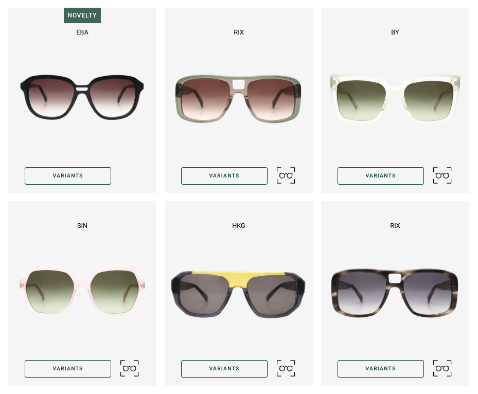
Let’s take a quick look at a real-world example. VTO buttons (glasses icon) visible directly on the collection page, inviting shoppers to try before they click.
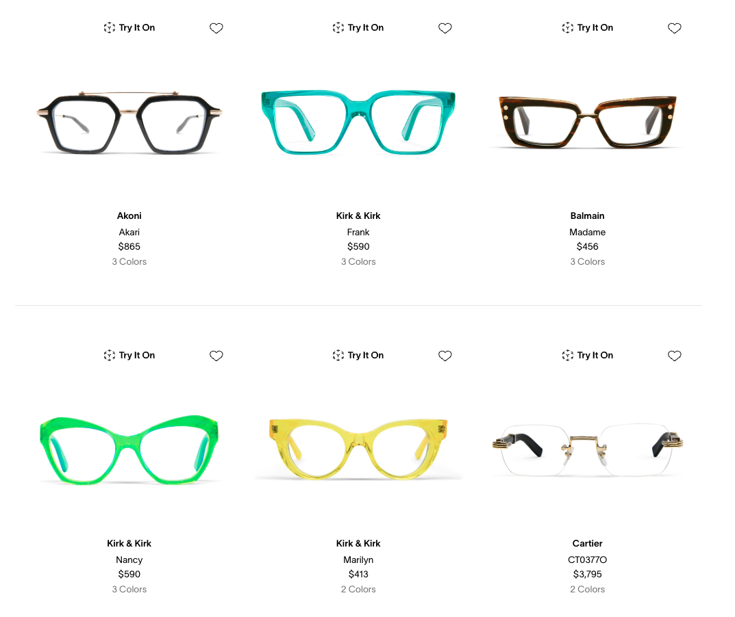
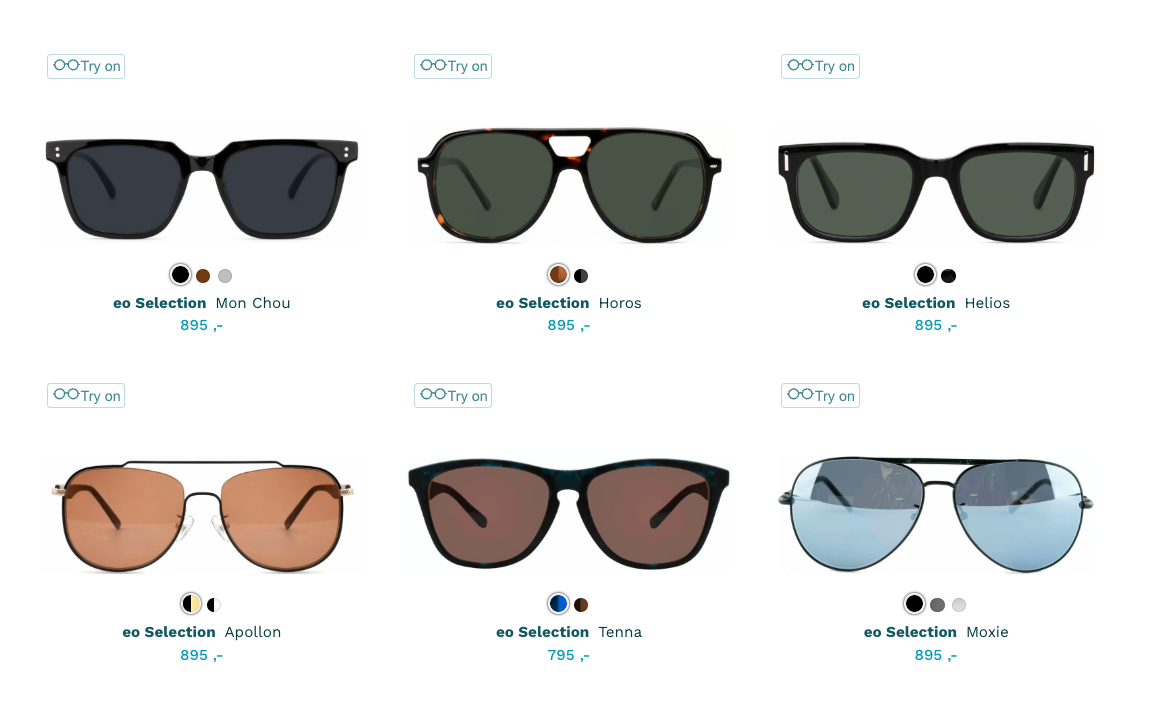
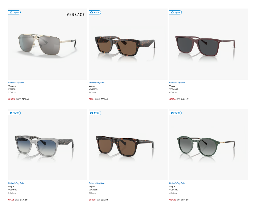
While product page VTO is still essential, offering a preview at the browsing level invites more casual interaction. Shoppers don’t need to commit to a click — they just try and decide instantly.
Why it works: Behavioral science & shopper psychology
When customers see the Virtual Try-On icon early, it activates curiosity. It also gives them more control over their discovery journey. In short, it creates a more playful and personalized shopping experience.
Studies in UX behavior show that:
-
Interactive elements on collection pages lead to 30% higher click-through rates.
-
The earlier customers engage with a product feature, the higher the chance they convert.
By placing the VTO button upfront, you’re meeting shoppers where they are — at the moment they’re most open to exploring styles.
How to add Virtual Try-On to tour collection page
If you’re already an Auglio customer and using Virtual Try-On on your product pages — you’re halfway there. Enabling it on your collection page is a lightweight update, and our team is here to support you.
Want to get started?
👉 Contact us at [email protected] or directly through the sales representative you’ve been in contact with.
Small Button, Big Impact
Virtual Try-On is one of the most powerful tools in modern e-commerce — but its impact is multiplied when it’s placed strategically. By adding a Virtual Try-On button to your collection page, you create earlier engagement, more try-ons, and a higher likelihood of conversion.
In the age of instant decisions and short attention spans, even small enhancements like this can set your store apart.
Tags: Virtual Try On Eyewear e-commerce